

Whiteboards are fantastic tools for thinking out loud. Whether you’re explaining ideas to an audience of thousands, or working through some problems in a conference room you’ve snaffled, starting with a big, blank whiteboard can help you get it all out there.
Once you’ve solved your problem on the whiteboard, you have a new problem of recording your work for later reference.
Plenty of approaches have been created with varying cost, complexity , and success. Electronic whiteboards can provide a printout of whatever you drew, but are expensive, require consumables, and the know-how to use the one you found in the room. Smartboards are neat and provide benefits to be sure, but amplify all the problems. Expensive to buy, complex to use.
All of these solutions take away from the biggest benefit of using a whiteboard - they’re simple! You grab a pen and go. No fuss, complete focus on solving your actual problem.
The rise of digital camera technology brought us to the verge of a fantastic solution - use your camera to take a photo. Download it to your computer and off you go. Perfect - except that your photos can be let down by bad lighting, poor focus, low resolution, and not having your camera around.
As smartphones and their integrated cameras have improved, the likelihood of you having a decent enough camera around to snap a whiteboard pic has increased. Even better, your tiny little computer can email it to anyone you want, or upload to your photo stash. Brilliant, but you’re still up against problems of lighting, focus, and having your final output being a photo of the thing you created, rather than the actual thing you created.
Enter Microsoft Lens. It helps you to take a photo of your whiteboard (or piece of paper for that matter), and then automatically processes the photo to turn the content on the whiteboard into a digital drawing. It crops out everything that isn’t the whiteboard, kills reflections, cleans up the background so it is simply white, and enhances whatever it was you wrote up there.
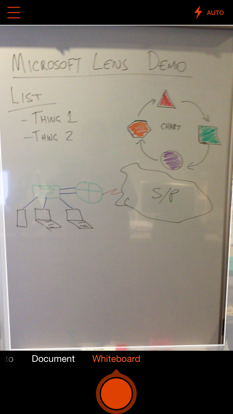
Microsoft Lens has a super simple interface. Point it at the whiteboard, hit the big red button.
Once it’s done all that, you choose what you want to do with your picture. Native export options include the Microsoft Office apps, OneDrive, Photos app, and Mail.

Export to all the things.
It gets even better - hidden down in the corner is the familiar share icon. Tap that and up pops the Share Sheet with all of your setup options including Basecamp. Pushing a whiteboard pic straight to the relevant Basecamp project, correctly named and commented is just fantastic. So many intermediate steps saved because it just works.

Microsoft Lens is simple, free, and just works - all the things that you want from a whiteboard.

Poor lighting didn't help this pic (some ugly shadows up the top that'd need to be cleaned up), but overall pretty good. Reflections are gone, the contrast is greatly improved, and the drawing itself has been sharpened up.
